

Yumigo just got a new mascot
Giving the brand a face is Yumigo's strategy for standing out in the Health & Wellness app crowd
The project
Yumigo helps people stick to their meal plan consistently. Trying to make the whole experience a little less complicated.
It turns the classic PDF taped to the fridge into an organized assistant, complete with an automatic shopping list, ongoing support, and a journal to track progress.
The Client
Domenico is a freelance developer.
The kind of guy who builds the solution himself when he's got a problem.
He's shipped several apps, all born out of his own personal problems, because "someone out there is probably just as frustrated as I am."
The impact
Spark curiosity and drive downloads on the App Store and Google Play listing
Give the app a personality to make it more engaging and enjoyable to use.

Domenico, web developer and entrepenaur
"The result is great. The approach made all the difference. It still guides me whenever I think about new features for the app."
How the mascot came to life, in 5 phases
the short version, because I know you've got stuff to do
PHASE 1 ・ Figuring out who we are
Yumigo exists to help people stick to their meal plan. Without making them miserable, I'd add.
Since we're dealing with people and some pretty delicate lifestyle changes, we started by asking ourselves:
If Yumigo were a person, who would they be?
I pitched 5 personalities:
👨⚕️ The wise doctor: traditional, reassuring
📋 The organized assistant: methodical, practical, no-nonsense
🍳 The kitchen helper: precise, forward-thinking
🏋️ The motivational coach: driven, goal-oriented
🧑🤝🧑 The true friend: empathetic and supportive
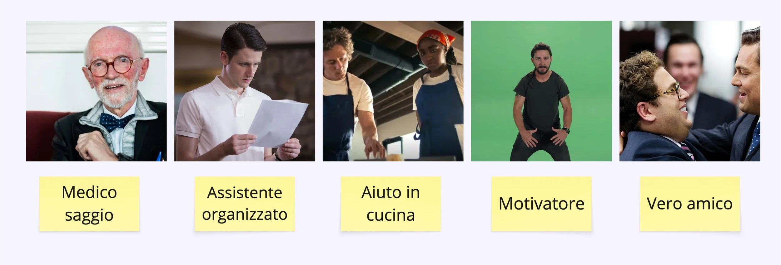
Dr. Franco Berrino・Jared di Silicon Valley・Sidney di The Bear・Shia Labeouf in Just do it speech・Donnie Azoff in The Wolf of Wall Street
After debating the pros and cons of each, we ended up in a tie, so we went to a tiebreaker. Settled with the question:
Who would you want pushing the cart on your next grocery run?
The organized assistant won. Sorry, Donnie 🥲
PHASE 2 ・ Market research: what's everyone else doing?
o design a visual identity that actually stood out, I dug into competitor apps and others in the health, wellness, and food space.
I downloaded dozens of apps, collected hundreds of screenshots, and dumped everything onto a board to find inspiration in line with our organized assistant.
My magnifying glass zoomed in on:
Value proposition
what's the hook used to convince people to download it? Speed? Is it built for a specific audience…
Use of illustrations
How do the visuals support the message? Is there consistency between the icon and the inside of the app? Do they align with the value proposition?
App name
Any interesting names out there? Any recurring words?
Icon and colors
Which colors dominate the category? Any exceptions?
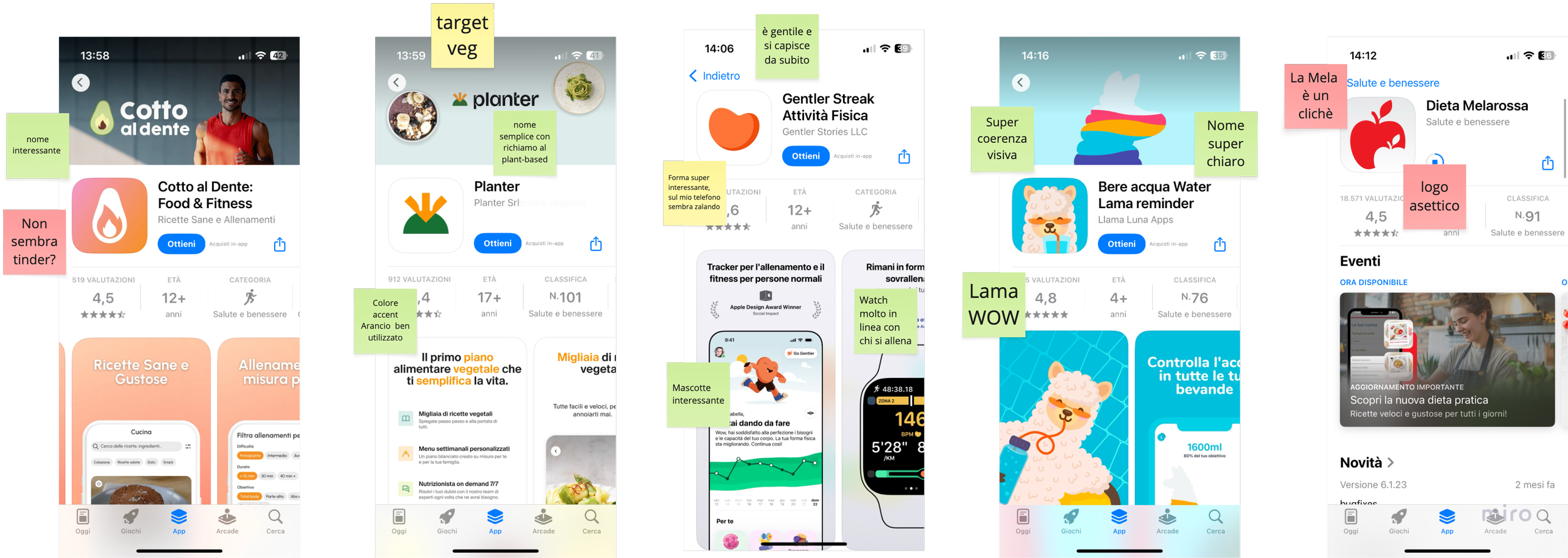
Annotazioni su screenshot degli store di app competitor ed affini
PHASE 3 ・Giving the assistant a shape
Ideas start taking shape. I shared some sketches with the team to find a direction, and rule out a few others.
It was clear from the start we'd steer clear of the same-old healthy-food icons (apples, carrots, avocados…) in favor of something more distinctive: something that said assistance and organization, with a casual tone.
I explored a few directions:
Eggs, walnuts, almonds
Bento box = the Japanese compartmentalized container for a complete, balanced meal on the go.
Geometric shapes
Productivity-themed icons (checkmarks, clipboards, sticky notes…)
Hybrid veggies: a mashup of different foods
Robot veggies: to evoke digital assistance

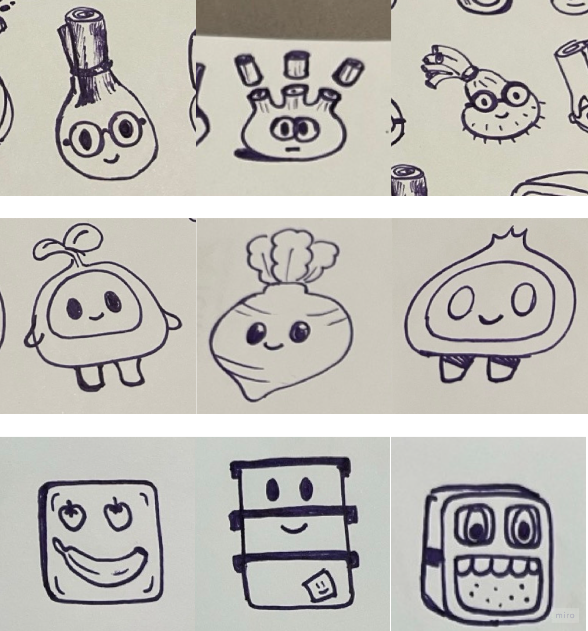
A few early sketches for the app's mascot
PHASE 4 ・ Polishing and plating
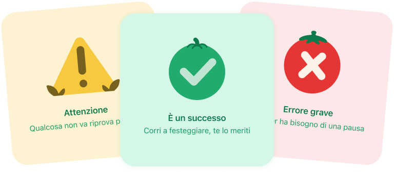
The drafts were refined, fixing details and adding supporting assets like backgrounds, secondary illustrations, and the full range of mascot poses.





-
Every part of the mascot is a component. Each with multiple variants, adding up to: 7 hats, 11 expressions, 7 arm types, 3 feet, 4 bellies. Over 6,000 possible combinations.
PHASE 5 ・ Putting the mascot to work in the app
I mapped out which moments in the user's journey could use a little mascot support.
Like the first landing screen before sign-up, to give a warm welcome. Or when there are no meal plans saved yet, to guide people through adding one. Or to support someone when they go offline and the app needs a connection.
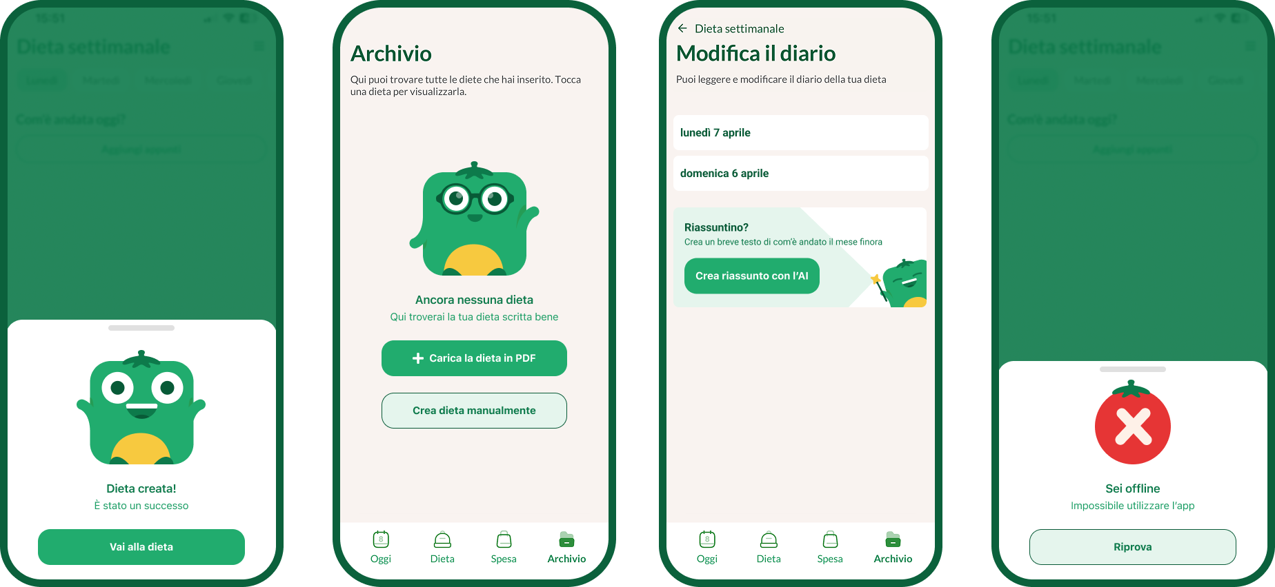
The mascot showed up across the app's interface: bottom sheets, empty states, banners, error screens.
Conclusion
The app now has an organized and friendly assistant that walks people through the twisty experience of sticking to a new meal plan.
The app now has a defined visual identity in a highly competitive market, plus a scalable illustration system ready for whatever comes next.
